New Covers
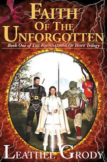
I figured I'd post a new look at the covers in progress. I can't say I am totally convinced with the new FotU background yet. I'll have to see what it looks like printed and how clear the title is. I still really enjoy the fire, smoke, and lightning look from the hardcover, so that still may get put into the current red and blue borders of the new cover style. The main improvement was to bring the characters a lot closer. The original design looked nice in hand, but the characters are smaller than those on other books, so they didn't stick out from 10ft+ away. I will say I have always been partial to the oval fire/smoke look so who knows, I might go back to that and use the characters close up as they are in the in progress. This would mean cutting out all characters except Jarod and Rebecca.
The spine will get a new overhaul as well.
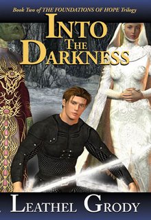
The spine will get a new overhaul as well.


Here is FotU's current hardcover print and the original plan for Into the Darkness.
Not too much to add. July 4th I will spend the whole day touring across Michigan getting bookstores setup for the new promotion. I'll be visition Grand Rapids, Lansing, & Flint. A whole lot of driving but a whole lot of stores!


0 Comments:
Post a Comment
<< Home